Twist and Pop cards are all the craze at the moment. I love them and they are so much easier than they look. This is mine for this month:
For something different I made a square card!! It's a 6"x 6" square card with a heavy Whisper White base mounted with a square of Dapper Denim card stock and the top square is standard Whisper White card stock. The front is quite simple because of all the work on the inside.
The only fancy feature on the front, is the oval cut out using the Layering Oval Framelits - it's a void as opposed to layering on top of the card, it's removing layers down to the card base. I used a slightly smaller one on the Dapper Denim and then a larger one on the top layer of Whisper White. The sentiment is stamped in Dapper Denim ink on what is the base card.
All of the stamps including the sentiment are from the Blooms & Wishes stamp set which is available in photopolymer only. It is such a versatile set because the images are pixelated (they look textured when you stamp them) and can be stamped generationally for different effects.
The main flower is stamped in Dapper Denim and the smaller daisy-style flowers are stamped in the same ink but stamped-off first (so second generation colour). The centre of the large flower is stamped in Night of Navy to contrast with the blue.
The poinsettia style flowers are stamped in Tip Top Taupe ink and the smaller wattle flowers in stamped-off Tip Top Taupe. The leaves are in Mint Macaron and generationally stamped too. The little whispy bits are stamped in Tip Top Taupe. I highlighted a few areas randomly with Wink of Stella Clear.
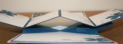
I followed MayMay's Twist & Pop instruction video on You tube on how to make my card and merely adjusted it for a square card. I used a piece of A4 Dapper Denim for the feature and the only difference is that the wings are not as long so they adhere to the middle of the mountain valley feature in the centre.
I matted each side of the base card inside with a square of Basic Black card stock so that the Dapper Denim feature would really pop. This side angle shows where the "v" meets.
I also wanted to decorate the inside to feel like a garden but leave enough space for messages and anything else that might need to be included.
I wanted the stamped flowers to carry over on to all aspects of the project but I was mindful of it being overwhelming and this was part of my motivation in selecting the subtle colours that I used. You can see that I used Dapper Denim card for the fancy fold and design feature so that it would tie in with the stamped images and be framed by the black matting on the base card. By keeping both the feature and the mounting fold in the same colour they are more seamless.
I think that the muted stamping doesn't distract from the fold and impact of the feature. I plan to write something about the person that I am gifting this card to on each of the four spaces across this design feature. Here are some close-ups of the featured panels:
Again I used the colours that I had employed on the front of the card with highlights in Wink of Stella.
The sentiment is fairly generic and will fit most occasions. It is also the perfect size to allow more space for writing.
I kind of wanted a water colour feel to the stamps and really like how these stamps stamp when they are stamped off first.
The touches of Wink of Stella work beautifully with the watercolour style stamping. The placement of the stamped images and the touch of bling keep the fancy fold feature as the main focus of the project which is the purpose of the card.
This is the top section of the card. Because some area on the inside of the card is compromised by the fold design I thought that it was a good idea to continue the stamping up to the top as well as across the bottom of the card where it is traditional to write.
Dapper Denim is becoming one of my favourite colours this season and has a classic feel to it. This is the base of the card and has sufficient space for my own message.
I hope that you have found some inspiration from our hope, I certainly enjoyed making the card.
Don't leave us yet, you still need to see French's incredible card - this lady is so creative and clever in how she goes about her projects and business.
Until next time, I hope your life glitters and shines!
Shanni xx
December Blog Hop Order
Shannean Moncrieff (that's me)


Very nicely done!
ReplyDeleteWhat a lovely card! the colour combo is perfect!
ReplyDeleteIts spectacular my lovely. What a classy project <3
ReplyDeleteLove this size very lovely thank YOU
ReplyDeleteI loooove everything about your card :-) totally agree with Monica, it's very classy.
ReplyDelete