Saturday, September 25, 2021

Totally Techniques - Torn Edge Technique

Welcome back to another Totally Techniques Design Team blog hop, this month we are highlighting the "torn edge" technique. 

These are my projects:


I couldn't decide on which part of the "torn edge" to use. . . but here's a great explanation from Split Coast Stampers which will make it easier for you!

These are the materials I used for the three cards:

Happy Holly-Days stamp set
Christmas Season stamp set 
Very Versailles stamp set
Welcoming Woods stamp set
Friends are Like Seashells stamp set
Forever Fern stamp set
Seasonal Labels Dies
Basic White card stock
Mossy Meadow card stock
Real Red card stock
Crushed Curry card stock 
Balmy Blue card stock
SAB Be Dazzling Specialty Paper
Tuxedo Black Memento Ink
Mossy Meadow Classic Stampin' Ink
Old Olive Classic Stampin' Ink
Early Espresso Classic Stampin' Ink
Soft Suede Classic Stampin' Ink
Crumb Cake Classic' Stampin' Ink
Sahara Sand Classic Stampin' Ink
Stampin' Blends
Shimmery Crystal Effects
Blending Brushes


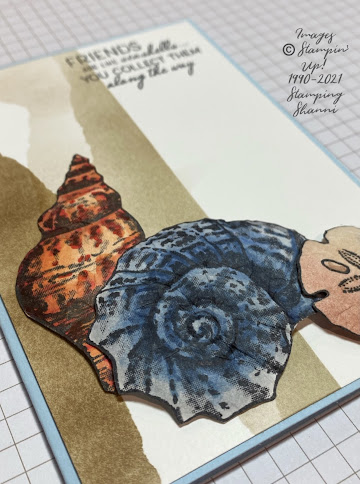
For the first card featuring seashells, I used the torn edge to form a stencil to do the three different shaded features on the right hand side of the card. I marked off a section of the Basic White card mount with post it notes and then held the stencil against the white card roughly in the centre -- I shaded from the torn edge back towards the post it notes in Sahara Sand using a blender brush.
I then shifted the torn edge to a different section of the white card, closer to the post it note section and blended Crumb Cake ink from the torn edge stencil towards the post it note border. You can see the darker section. Finally I flipped the torn edge stencil towards the left hand side of the white card and blended Soft Suede ink towards the left edge with a blender brush.
The shells from the Friends Are Like Seashells set were stamped in Tuxedo Black ink on Basic White card and coloured using the following Stampin' Blends -- Light and Dark Pumpkin Pie, Light Poppy Parade, Light and Dark Night of Navy, Light Smokey Slate, Ivory and Bronze.
I fussy cut the shells out and distressed the card stock on the rear of the images to add some dimension and texture.
I then adhered them to the card with dimesionals so that they layered and add depth to the layout of te card.
The sentiment is from the same stamp set and is stamped directly on the card in Tuxedo Black ink. This is a really quick and easy technique to us with dramatic effect.

The second card uses "torn edges" as a feature of the card. I am not so happy about my colour choice in the card but I wanted to draw out the colours of the bird. There was a lot of fussy cutting on this card. I wanted a vintage feel and thought the Be Dazzling specialty paper would lend itself to the theme.
Pine cones from the Christmas Season stamp set where stamped in Soft Suede and Early Espresso on Basic White card (a two step stamped image) and fussy cut. The two different foliage images were stamped in Old Olive and Mossy Meadow and the spruce leaves in Mossy Meadow, the spruce leaves were fussy cut but fortunately the larger leaves have a matching die in the Season Labels Dies pack which complement the stamp set.
The bird is from the Happy Holly-Days stamp set, stamped in Tuxedo Black on White card and coloured with the Stampin' Blends -- Ivory and Bronze, Light and Dark Crumb Cake, Dark Crushed Curry, Light Poppy Parade,Light and Dark Cherry Cobbler. I snipped the beak slightly and inserted apiece of the fussy cut spruce to make it look like the bird was holding the greenery. I coated the bird in Shimmery Crystal effects to help it stand out from the leaves and Be Dazzling paper which was also cut with the Dies from the matching set.
I stamped the birch trees from the Welcoming Woods stamp set in Early Espresso on the Crushed Curry card after I had torn the yellow and Real Red card edges to match so that the red would frame the yellow background.
The sentiment is stamped directly on the Mossy Meadow card in Tuxedo Black. The greeting comes from the Happy Holly-Days set as well.

Card 3 uses both pieces of the "torn edge" to create a channel on the Basic White card for an interesting feature. I blended the Soft Sea Foam ink with a blender brush between the torn edges, then stamped the script from Very Versaille in Crumb Cake and the foliage from the same set in Mossy Meadow whilst the stencils were in situ so the stamped images only appear in the channel of colour.
The "fly poo" stamp from the Forever Fern stamp set is stamped in Early Espresso to create interest below the bird image.
The sentiment is from the Happy Holly-Days set stamped in Tuxedo Black on Basic White card and cut out using the shape from the Seasonal Labels die set, which I shortened by rubbing it through the die a second time.
I coloured the bird with the same colours as detailed for the Mossy Meadow card above. I fussy cut the bird and adhered it directly to the white card. The card base is Real Red and lined inside with a rectangle of Basic White.

I hope you have found some inspiration in today's cards. Take the tie to check out the other members of our Design Team -- they have done an exceptional job!

Until next time, thanks for stopping by,

Cheers
Shanni xx

You are invited to the Inlinkz link party!

Click here to enter


Saturday, September 18, 2021

Fancy Folds - Diagonal Faux Pocket


Welcome back to another Fancy Folds International Design Team blog hop. This month we are featuring the Diagonal Faux Pocket which is a super easy card. 

I hope you have been inspired by my fellow design team member, Gina who always makes beautiful cards, sometimes it's hard to follow her creation because I don't know that mine will be worthy. This is my project:

I followed the easy to understand YouTube Tutorial by LeeAnn Greff and modified it slightly to make a square card.

Materials used for the cards included:

Merriest Moments stamp set
Merriest Frames Hybrid Embossing Folder 
Sahara Sand cardstock
Basic White cardstock
Peaceful Prints Designer Series Paper
Be Dazzling 6"x 6" Specialty Paper (SAB)
Real Red Classic Stampin' Ink Pad
Garden Green Classic Stampin' Ink Pad
Pear Pizzaz Classic Stampin' Ink Pad
Tuxedo Black Memento Ink Pad
Blending Brush
Champagne Rhinestones
Cherry Cobbler Gold Ribbon 
White Baker's Twine
Tag Topper Punch
My base card is Sahara Sand mounted with a square of Basic White inside, with each triangle front lined with a piece of Peaceful Prints DSP. I wanted something that was subtle but at the same time festive and the Sale-a-Bration designer series paper is perfect with traditional colour schemes.
I wanted to feature one stamp set only for this card and the Merriest Moment Bundle lends itself to the project perfectly. I love the hybrid embossing folder and dies -- they are so clever and versatile.
The poinsettia flowers are stamped in Real Red on Basic White, the leaves (which are actually holly leaves) are stamped in Garden Green and the small bushels are stamped in Pear Pizzaz.
The matching dies make the whole project easy and the flowers are really forgiving so you can't muck them up. They are designed to layer. I added dimensionals to the flowers to give them some depth and added rhinestones to the centres for a touch of bling.
Using the larger floral die, I cut the shape from a piece of Basic White and added some colours to the edges with a blender brush (love these tools). I used Pear Pizzaz because I wanted something that would complement the Sahara Sand but not overwhelm it. I also cut an additional outline of the floral background in Sahara Sand to mount the floral die. It reinforces it and also offers a nice "finished" look for the whole card internally.
I shaped the flowers al little by folding the petals a bit. I placed the leaves strategically to avoid covering the sentiment and card details. The bushels were just added to balance the arrangement.
The sentiment is stamped in Tuxedo Black Memento Ink on Basic White and cut using the stitched edge rectangle which comes with the hybrid die pack. I felt it frames the greeting and helps the card front feel more complete.

The whole card took about 15 minutes to make. Its very simple and is a great style of crd for Christmas given that its an unusual shape/fold.

The project has great impact and I would encourage you to give it a go.
Because the above project was so quick I thought I would share another simple pocket card:
I love the simple tutorial by my friend Patty Bennett for the "double pocket" card. Its short, easy to follow and lots of fun to make.
This card takes one full sheet of cardstock. You need a scoring tool, I use my Paper Trimmer with the scorer for convenience.

I used the same colour scheme as I did for the faux pocket card. Base card of Sahara Sand, mounted with Basic White internally and lined with the Peaceful Print DSP which is a free Sale-a-Bration pack! You can use which ever side of the DSP that you like, but I wanted the two pockets to be lined with the same design and a contrast for the card proper.
Again I stamped the poinsettias in Real Red and the leaves in Garden Green. Again I dimensionalised the flowers to give them some depth.
This time I wanted the sentiment to "pop" a little so I mounted the stamped stitched rectangle on same of the Sale-a-Bration Dazzling Specialty Paper.

To add interest and layers to the card I added a tag to the rear pocket, I used the same colour scheme and added some Cherry Cobbler Gold Ribbon to assist with removal.
What I love about the card is that it feels substantial and sturdy.
I hope you are inspired to try this card as well, it's a great card to include a  gift card with the card.
Don't leave us just yet, we still have heaps to share. Check out my very talented friend, Mary Ann's amazing project this month!


Thanks for stopping by. hope you have had fun!

Stay sparkly!

Shanni xx

Order of our September Hop

Nadine Schweda (Germany)
Aude Barbara (France)
Fiona Carson (New Zealand) not hopping
Gina Connor (United Kingdom)
Shannean Moncrieff (Australia) - that's me!
Mary Ann Rossiter (United States)
Astrid Hofmann (Austria)
Stephanie Nash (Canada)
Miranda Mols-Heidnrath (Netherlands) not hopping


Sunday, May 30, 2021

Totally Techniques -- Layering Stencils Inking

Welcome back to another Totally Techniques Design Team Blog Hop, this month we are featuring layering stencils, using ink on stencils.

This is my project:
I chose to make a square card for something different😉 


These are the sets, tools and materials I used:

Tasteful Touches
Free as a Bird
Basic Black Card stock
Whisper White Card stock
Rose Gold Metallic Specialty Paper
Tuxedo Black Memento Ink
Mango Melody Classic Stampin’ Ink Pad
Pumpkin Pie Classic Stampin’ Ink Pad
Cajun Craze Classic Stampin’ Ink Pad
Blending Brushes
Basic Patterns Decorative Masks
Spritzer
Gilded Leafing
Tombow Glue
Forever Flourishing Dies
Meadow Dies
Elegant Faceted Gems
Stampin’ Blends — Dark Cherry Cobbler, Light and Dark Poppy Parade, Dark Daffodil Delight,
My base card is 6” x 6” Basic Black card lined on the inside with a square of Whisper White. I mounted the outside (the stamped side) with a square of Rose Gold Metallic Specialty Paper — I love a touch of bling!
The rose gold paper is mounted with a square of card which started as Whisper White; this is where the layering stencils came in . . .
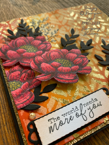
I initially blended Mango Melody, Pumpkin Pie and Cajun Craze inks randomly on the card using the Blending Brushes. I made sure there were variations in colour depth and that all the colours merged so that there was no white shining through the ink. I then lay the stencil from the Basic Patterns Decorative Mask over the coloured card and spritzed it with water. You don’t need much water. I left it for say 10 seconds and dabbed off the excess with paper towel.
The water “lifts” some of the colour and makes the pattern appear lighter than the blended coloured background.
Once the stencilled pattern had dried, I lay the same stencil over the top of the pattern, but slightly below the spritzed areas; they are aligned but not identical. I then applied Tombow Glue using a baby wipe in the stencil voids and rubbed the Gilded Leafing over the glue. You brush off the excess.
This combination of stencilling creates the complex background that is both rich and gives the impression of texture because of the water marks. It’s so simple but dramatic. My sister gave me the idea for this in a team swap we held with the release of the new Annual Catalogue.
I stamped the leaf image from the Tasteful Touches set directly onto the background in Tuxedo Black Memento Ink. The flowers were stamped on a scrap of Whisper White card and I coloured them using Stampin’ Blends in the colours listed above. I fussy cut the flowers.
The black leaves were cut using the die from the Forever Flourishing Die set in Basic Black. I adhered them directly onto the background card. You will see that I snipped off a few stems to give the layout a more balanced appearance. The flowers were then adhered and mounted with dimensionals to add depth and interest.
Sentiments can be challenging — I chose this sentiment from the Free as a Bird set. It’s stamped in Memento Ink. I blended some pumpkin pie across the white to make it less stark and I mounted it on the basic black die shape from the Meadow Dies. I actually ran the stamped white card through the same die then cut along the faux stitched line so that it would sit perfectly in the shape.
No card is complete without some bling — I added the hold Elegant Faceted Gems. I felt the little speckled gold and translucent gems married the whole project together.
I hope you feel inspired to try layering stencils, they add a whole new dimension to projects and lend a mixed media feel to the card.

Check out the rest of the design team’s projects — as always they are awesome!

Until next time,
Shanni xx


You are invited to the Inlinkz link party!

Click here to enter