Saturday, December 31, 2016

Totally Techniques - Watercolour Wash

2017 is on our door step and it's going to be an incredible year. I can feel it in my bones. . .

Thanks for hopping by, wasn't Amy's creation incredible. We are so lucky to have such creative members on our Totally Techniques Design Team. . .

So this month's technique is Watercolour Wash backgrounds and here is my card:
I thought it only right to make a card to celebrate the start of 2017 and for something different I made a large rectangle (landscape) card. The base card is Basic Black mounted with a rectangle of Gold Foil Card, then a minutely smaller rectangle of Silver Glimmer Paper and then mounted with Whisper White as my stamping canvas.
 I did my watercolour wash background with Tuxedo Black Memento Ink and an aqua painter, followed by the smallest smudges of Smokey Slate wash. I think we often forget that the Memento Ink is waterbased and can be used for water colouring in the same way as out classic ink pads. I also wanted to make the strokes in my background quite clear rather than subtle and blurred ~ my goal was to make it look like movement and reflection. . .
I heat embossed the sparklers from the It's a Celebration set in the holiday mini which is only available for a few more days. I love the Gold Stamping' Emboss for this type of project because it makes the stamped images pop that little more.
The numbers were cut out of Silver Glimmer Paper and Basic Black card stock using the Large Numbers Framelits - I love these framelits and use them for so many projects, they are a must have in my book. I shadow mount the numbers so that they pop more and I have dimensionalised them on this project for added texture and interest.
To add a greater sense of celebration to the card I cut the swirls from Gold Glimmer Paper using the largest swirl from the Swirly Scribbles Thinlest. I wanted the suggestion fireworks and action and thought that these gold elements balanced the card nicely.
The sentiment is from Here's to Cheers and embossed with the Gold Stamping' Emboss on Basic Black card and punched out with the 1 3/4" Circle Punch. I dimensionalised it too.to add some more height to the card on top of the layers.
Final touch was the addition of the stars from the Metallic Enamel Shapes accessories, for added bling and of course I heat embossed a sparkler on the inside.
Wishing you a sensational start to the 2017 year, stick around and check out what Nadine has to share - her creations are always breathtaking!
Happy New Year - fill the year with sparkles, bubbles and bling!

Cheers
Shanni xx

Order of Blog Hop
Shannean Moncrieff (that's me)

Saturday, December 10, 2016

Fancy Folds Twist & Pop Blog Hop


Another month, another hop. Thanks for stopping by and I hope you have enjoyed our Fancy Folds blog hop so far this month. Wasn't Martha's project beautiful?!

Twist and Pop cards are all the craze at the moment. I love them and they are so much easier than they look. This is mine for this month:
For something different I made a square card!! It's a 6"x 6" square card with a heavy Whisper White base mounted with a square of Dapper Denim card stock and the top square is standard Whisper White card stock. The front is quite simple because of all the work on the inside.

The only fancy feature on the front, is the oval cut out using the Layering Oval Framelits - it's a void as opposed to layering on top of the card, it's removing layers down to the card base.  I used a slightly smaller one on the Dapper Denim and then a larger one on the top layer of Whisper White. The sentiment is stamped in Dapper Denim ink on what is the base card.
All of the stamps including the sentiment are from the Blooms & Wishes stamp set which is available in photopolymer only. It is such a versatile set because the images are pixelated (they look textured when you stamp them) and can be stamped generationally for different effects.
The main flower is stamped in Dapper Denim and the smaller daisy-style flowers are stamped in the same ink but stamped-off first (so second generation colour). The centre of the large flower is stamped in Night of Navy to contrast with the blue.

The poinsettia style flowers are stamped in Tip Top Taupe ink and the smaller wattle flowers in stamped-off Tip Top Taupe. The leaves are in Mint Macaron and generationally stamped too. The little whispy bits are stamped in Tip Top Taupe. I highlighted a few areas randomly with Wink of Stella Clear.

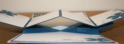
I followed MayMay's Twist & Pop instruction video on You tube on how to make my card and merely adjusted it for a square card. I used a piece of A4 Dapper Denim for the feature and the only difference is that the wings are not as long so they adhere to the middle of the mountain valley feature in the centre.
I matted each side of the base card inside with a square of Basic Black card stock so that the Dapper Denim feature would really pop. This side angle shows where the "v" meets.
I also wanted to decorate the inside to feel like a garden but leave enough space for messages and anything else that might need to be included.
I wanted the stamped flowers to carry over on to all aspects of the project but I was mindful of it being overwhelming and this was part of my motivation in selecting the subtle colours that I used. You can see that I used Dapper Denim card for the fancy fold and design feature so that it would tie in with the stamped images and be framed by the black matting on the base card. By keeping both the feature and the mounting fold in the same colour they are more seamless.
I think that the muted stamping doesn't distract from the fold and impact of the feature. I plan to write something about the person that I am gifting this card to on each of the four spaces across this design feature. Here are some close-ups of the featured panels:
Again I used the colours that I had employed on the front of the card with highlights in Wink of Stella.
The sentiment is fairly generic and will fit most occasions. It is also the perfect size to allow more space for writing.
I kind of wanted a water colour feel to the stamps and really like how these stamps stamp when they are stamped off first.
The touches of Wink of Stella work beautifully with the watercolour style stamping. The placement of the stamped images and the touch of bling keep the fancy fold feature as the main focus of the project which is the purpose of the card.
This is the top section of the card. Because some area on the inside of the card is compromised by the fold design I thought that it was a good idea to continue the stamping up to the top as well as across the bottom of the card where it is traditional to write.
Dapper Denim is becoming one of my favourite colours this season and has a classic feel to it. This is the base of the card and has sufficient space for my own message.

I hope that you have found some inspiration from our hope, I certainly enjoyed making the card.

Don't leave us yet, you still need to see French's incredible card - this lady is so creative and clever in how she goes about her projects and business.
Until next time, I hope your life glitters and shines!
Shanni xx


December Blog Hop Order
Shannean Moncrieff (that's me)

Saturday, November 26, 2016

Totally Techniques - Resist Technique


Can you believe that Christmas is less than a month away? This year has literally flown by, thanks for joining us for another Totally Techniques Blog Hop - this month we are doing "resist technique" and I am sure that you already have some incredible ideas. How amazing is Amy K's creation? Amy always has such beautiful work that I am a bit nervous following on from her. . .this is my creation for the month:
I wanted to do a thanksgiving card given that our American friends are celebrating this annual holiday and I wanted the colours to be reminiscent of fall as that is the season in the northern hemisphere and of course I couldn't resist using leaves for this technique (pun intended).

So the base card is Basic Black mounted with a square of Copper Foil card stock. I then mounted another square of Basic Black and the "orange" canvas is actually a square of the Fancy Frost Specialty Designer Series Paper from the Holiday Mini Catalogue.
I have sponged the Fancy Frost DSP with Pumpkin Pie ink - the paper is embossed on one side and de-bossed (or impressed) on the other. I have sponged the side that is embossed ~ the raises leaves pick up more ink than the flat areas which "resist" the ink. You will see that I have also stitched a few areas around the perimeter with black cotton to tie in the leaves and other features. I love this DSP as it adds texture to projects and can provide a completely different focal point.
The leaves from Vintage Leaves are heat embossed using Memento Tuxedo Black Ink and Clear Embossing Powder and Versamark on Whisper White card stock. I then saturated the leaves with water in a spritzer then dropped ink onto the card wth reinkers in Pumpkin Pie, Always Artichoke and Real Red, the water dispersed the ink, but the areas which were heat embossed resisted the ink colours. I fussy cut the leaves after they had thoroughly dried. The colour faded out of them significantly.
Sticking with the "stitching" theme I used the stitched framelit in the smallest square to cut a rectangle of Basic Black card stock and then heat embossed the sentiment from Paisleys & Posies in the Copper Stampin' Emboss Powder to marry in with the theme. I also cut some of the paisley flowers in the Copper Foil card using the Paisley Framelit Dies.
I used Gold Metallic Thread for housing behind the central leaf which is dimensionalised whilst the other leaves are stuck flush with the DSP. The sentiment is also raised with double dimensional. I wanted the housing to provide some relief between the leaves, add a touch of bling and texture to the layout.
Inside the card I mounted a square of Whisper White card stock on a square of Basic Black and a square of Copper Foil card. I like the added weight and it gives the whole card a luxurious feel. I also stamped the inside with the Vintage Leaves image in Memento Tuxedo Black ink.
I love the leaf images in this set - they are rustic and ageless. They are brilliant for every type of card and are versatile for males and females.
I hope that you have taken some inspiration from my "resist" technique and that you consider using the Fancy Frost Specialty DSP - it is great for any project, white on white or as I have used it where it can take on any colour for a project. The designs become more pronounced when ink is added and the pattern resists colour.

Don't leave us now check out Nadine's blog, she is always so creative and talented! I love her project this month!
Until next time
Shanni xx

Blog Order
Shannean Moncrieff (that's me)

Saturday, November 12, 2016

Fancy Folds Pop Up Book Card


Hope you are enjoying this months blog hop for the Pop Up Book Card and that you took the time to look at the easy to follow video from Norma at Splitcoast Stampers - this was exactly the instructions that followed for my card this month.

Wasn't Martha's card awesome? I love her choice of stamps and colours. . . it's always hard to follow in her footsteps!

This is my creation this month:
I have made a 6" square card with a base colour of Soft Suede mounted with a Rich Razzleberry mount. The the stamped square is Whisper White and I have embossed it with the Brick Wall TIEF and washed it with Crumb Cake ink using an aqua painter.

The scrolls have been cut from Old Olive card stock using the Flourish Thinlets. I trimmed and cut the flourish to fit the background and frame the Lots of Labels shape which I cut twice - once in Crumb Cake and next in Whisper White. I cut the crumb Cake label in half and mounted it behind the white to frame it a little.

Tuscan Vineyard is a beautiful set which I haven't utilised as much as I would like and this seemed the perfect opportunity to rectify my slackness - the grapes and the olive branch are from that set. I have stamped them in Staz-On Black, coloured the grapes with Rich Razzleberry and Elegant Eggplant, the leaves are in Always Artichoke and Old Olive. The olive branch is in Old Olive, Always Artichoke and the highlights on the olives are done with Daffodil Delight. I love watercoloring with aqua painters and ink pads.

The bird is from Best Birds - I have watercolored the bird using Soft Suede, Daffodil Delight and Rich Razzleberry.  You have probably worked out that I fussy cut the grapes (I cut down one of the bunches of grapes to suit my purposes) and the bird out and then coated them with a layer of the fine tip glue. It dried fairly quickly - possibly because it is so hot here at the moment. The sentiment from Tin of Cards is stamped in Rich Razzleberry.
Inside the card I stamped the flourish from Flourishing Phrases in Old Olive to tie in the theme from the front of the card.

The grapes and wine flasks and flagons from from Tuscan Vineyard and have been watercolored with Soft Suede, Crumb Cake, Chocolate Chip and Rich Razzleberry inks.  The bird from Best Birds was coloured using Daffodil Delight, Crumb Cake and Rich Razzleberry. I coated them with a layer of the Fine Tip Glue for a glossy appearance.
I actually stamped the images onto plain Whisper White card stock and fussy cut them so that I could position them strategically. The sentiment is from Garden in Bloom.
I positioned the images slightly off the top of the card and the bird's tail over hangs the fold as well.
I hope that you have taken some inspiration from my card and that you continue with our blog hop today.

Next stop on the blog hop is Anne Granger, check out her incredible project this month:

Until next time,
Shanni xx

Order of November Hop
Shannean Moncrieff (that's me)

Saturday, October 29, 2016

Totally Techniques - Ombre Effect


Hello again blog hoppers! Welcome to another Totally Techniques hop- this month we are highlighting ombre technique and here is my card:
You have probably just hopped across from Marine's beautiful blog, she is such a talented stamper.

Its that time of year when we can't get enough Christmas cards and this is made for a friend of mine in the USA who won't be with family at this crazy time. My card is 6" square heavy Whisper White card stock mounted with a slightly smaller square of Night of Navy card stock. The stamped square is also heavy Whisper White as it is better to water colour directly onto than the lighter card.
I loved Merry Mice as soon as I saw it and was coming up with a heap of ideas to watercolour and emboss it. So here I have embossed in black emboss powder. The sentiment is from Greetings from Santa (also heat embossed in black).
My colouring was not as good as it could be and I was a little impatient which resulted income leeching of colours but you get the effect lol. The mouse is coloured with Smokey Slate and Blushing Bride and the turtle neck is in Real Red. The leaves are Garden Green. The Christmas bauble I have treated as a little light as such and colours in Real Red and I coloured some rhinestones with a red Sharpie pen to make it seem as if it is illuminated. I used an aqua painter.
The background is where my ombre technique comes in - I have tried to watercolour from dark at the top to lighter at the bottom. I used Night of Navy and an aqua painter. I then stencilled some stars from the Hearts & Stars Decorative Masks with Craft Whisper White ink and a dauber. I wanted the subtle reference to the red white and blue of the USA. And the stars marry in perfectly with the little star on the mouse's tail.
Hope you have taken some inspiration and enjoyed our hop this month!

Be sure to stop by our next blogger the inspiring and talented Nadine Weiner

Until next time,
Shanni

Order of Blog
Shannean Moncrieff (that's me)